Matilda Bay Pharmacy

Questioning the traditional white aesthetics of pharmacy design, in a university heritage environment.

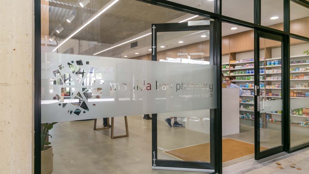
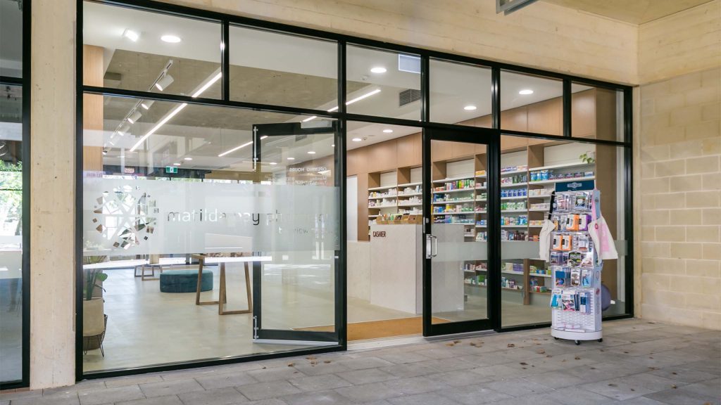
Situated in the Student Guild area of the University of Western Australia, the Matilda Bay Pharmacy was designed to buck the traditions of glossy white pharmacy aesthetics for a more sensitive and site contextual result.
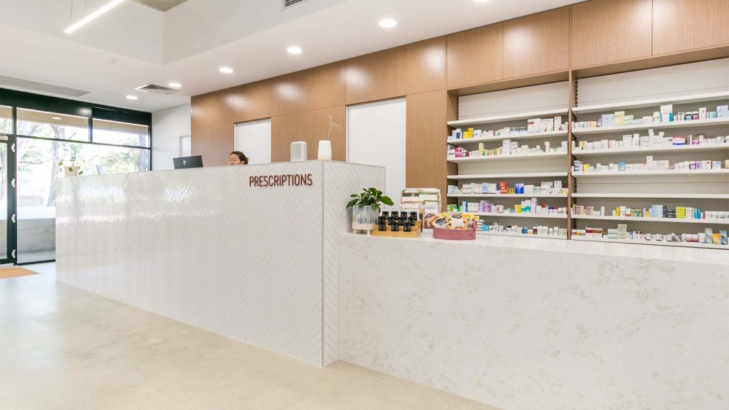
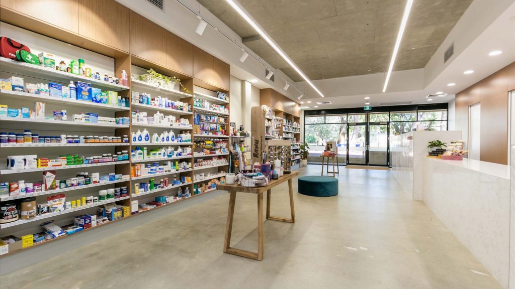
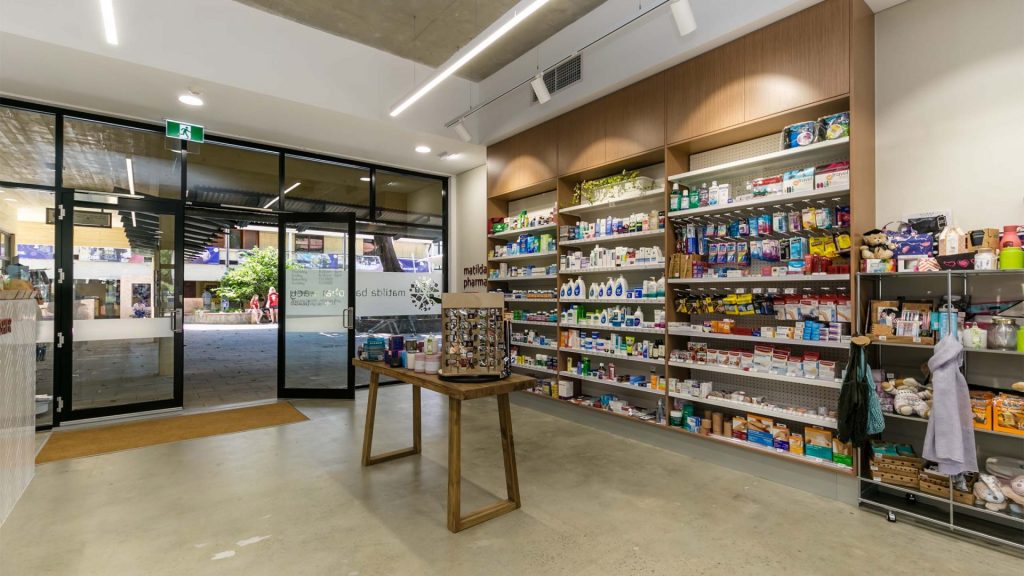
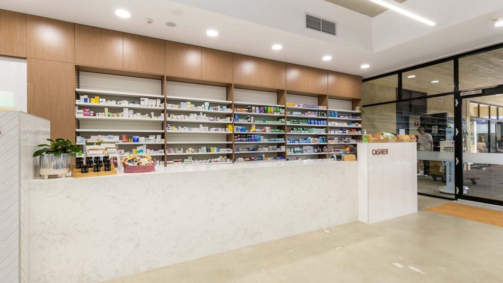
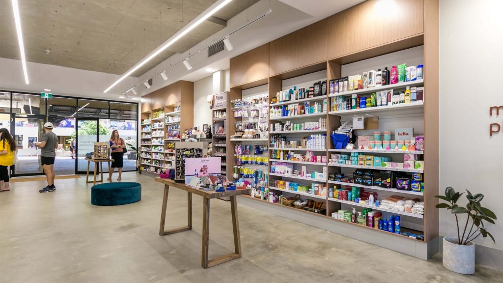
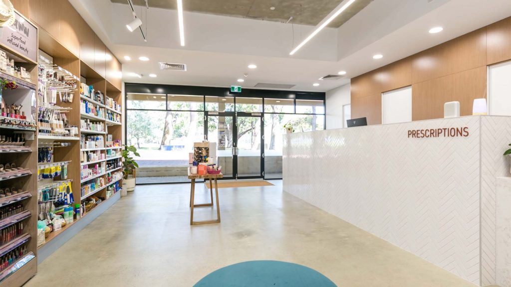
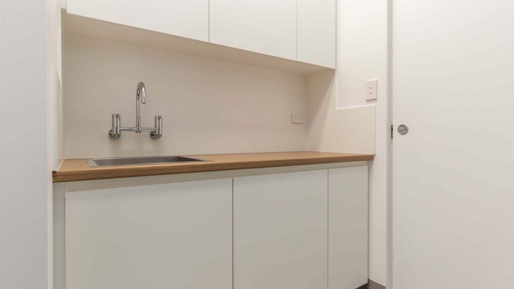
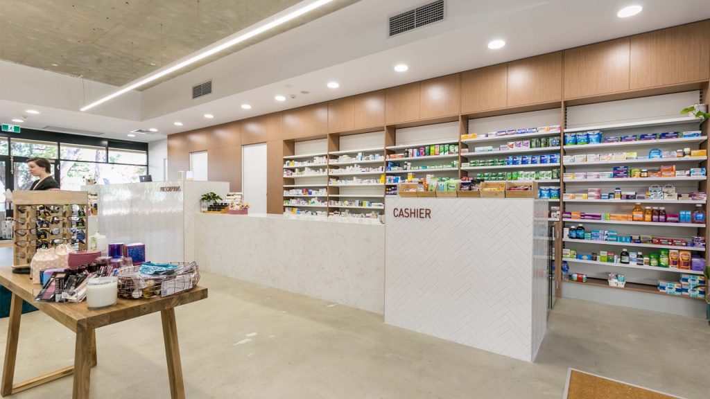
The design is centered around a dominant central axis, with a focus on removing proprietary and mismatched product placement stands, and instead keep the central axis clear, creating a clear line of site through the shop. Custom timber cabinetwork displays the goods in a uniform fashion, whilst on the opposite side, the cabinetwork hides the compounding rooms behind. Suspended lighting was utilized to emphasis the axis, whilst downlights were situated centered in each cabinetwork bay, accenting the proportions and rhythm of the space.
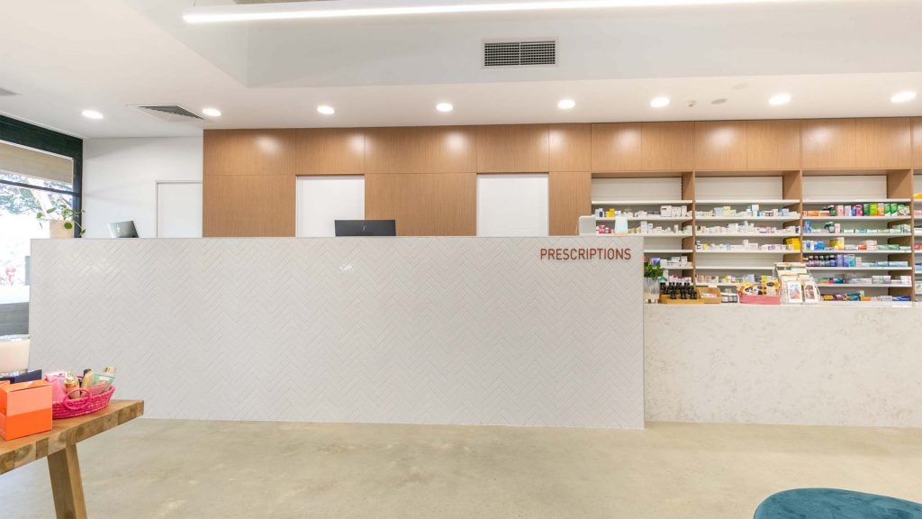
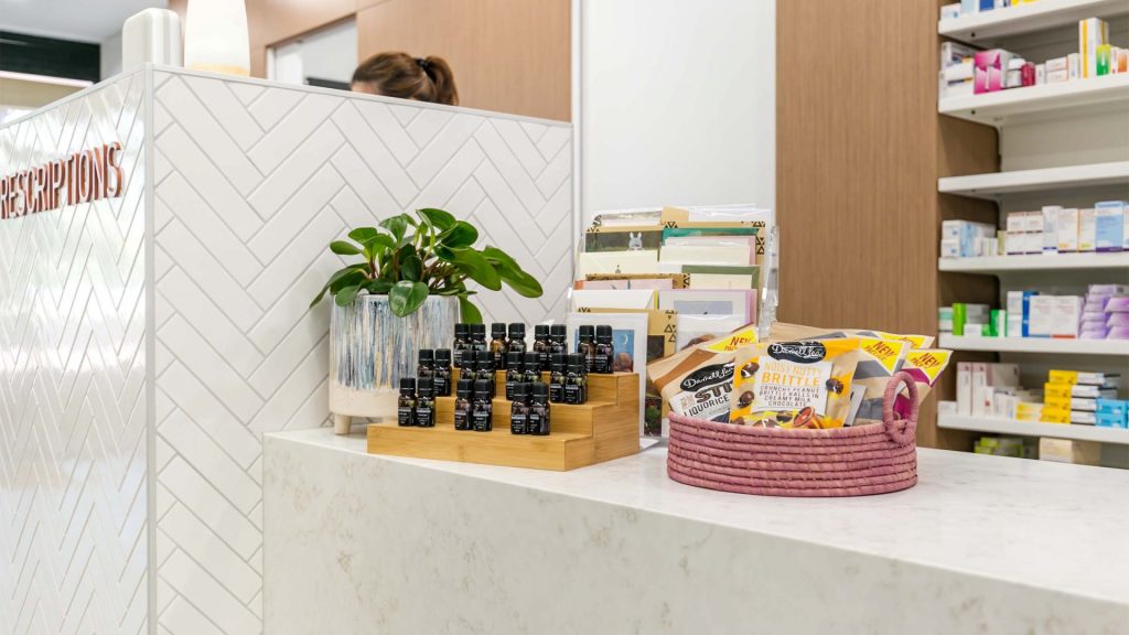
The premises was first stripped back to its rawest form, the paint sandblasted from all surfaces, the carpets removed, and all element stripped. Instead of replacing, the existing flooring, ceiling and walls were left raw, an aesthetic which connected the pharmacy to the traditional materiality of the university in a more direct manner. A marge counter was custom built to conceal the logistical shopfront items, clad in white stone and tiles, to further humanize the scale.
Specifications

Type
Commerical Fit-Out
Completed
2020
Size m2
100m2
Builder
Element Construction
Building Surveyor
Taycon Group

